Ever walk into a hardware store only to be met with a cold stare when trying to describe the plumbing doohickey you’re on the hunt for? Have you ever heard the proverbial record needle screech in a wine shop and have no idea what you said wrong about that bottle of Chablis in your hand? How about an art gallery? Lots of noses flying in the air in those places.
We get it. In most industries, insiders use unique jargon, in-the-know terminology, and esoteric information so they can assert their authority in their sphere of expertise.
And, full transparency here, the exhibit industry has its own idiosyncrasies, terminologies, and lots of insider talk. The difference is, at Nationwide 360, we ain’t snooty about it.
In that spirit, we’re pulling back the curtain on at least one aspect governed by event production wizards: Graphic Production. So hold on tight, below is a deeper dive into some of the most common graphic applications and their terms that might come into play when designing, building, and discussing your exhibit with your provider.
Static Print Mounted on Substrate
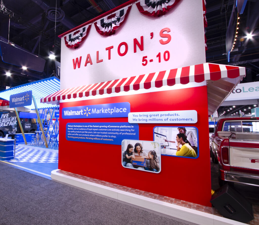
This is pretty much your standard print mounted on some sort of rigid board. For shorthand, we simply call it sintra print because, more often than not, we print directly onto the sintra material (it’s like a plastic board). It’s easier and cheaper than printing an image then affixing the print to a board, and looks just as good.
Other substrates that work for mounting prints include Gatorboard, PVC board, and Foam board. You can drop the ‘board’ off of ‘gator’ or ‘pvc’ and you’ll sound like a pro. If you just say ‘foam’ though, you might get some funny looks.
There are some subtle differences between the many types of substrates out there, but for all intents and purposes, they basically yield the same result: a rich, impactful photo image you can mount onto a wall surface or use as an infill panel in your exhibit’s frame system. They’re easy to remove, easy to replace, and relatively inexpensive.
A key limitation to keep in mind is that most of these boards come in 4’x8’ sheets. You want something that exceeds the limits of that, you’ll have to live with a seam since the application will be multiple sheets abutted to one another. Hate seams? You’ll want to go with a fabric graphic print (see SEG section below).

It’s pretty common to cut Sintra into unique shapes or round the corners of the board if the design calls for it.
SEG Fabric
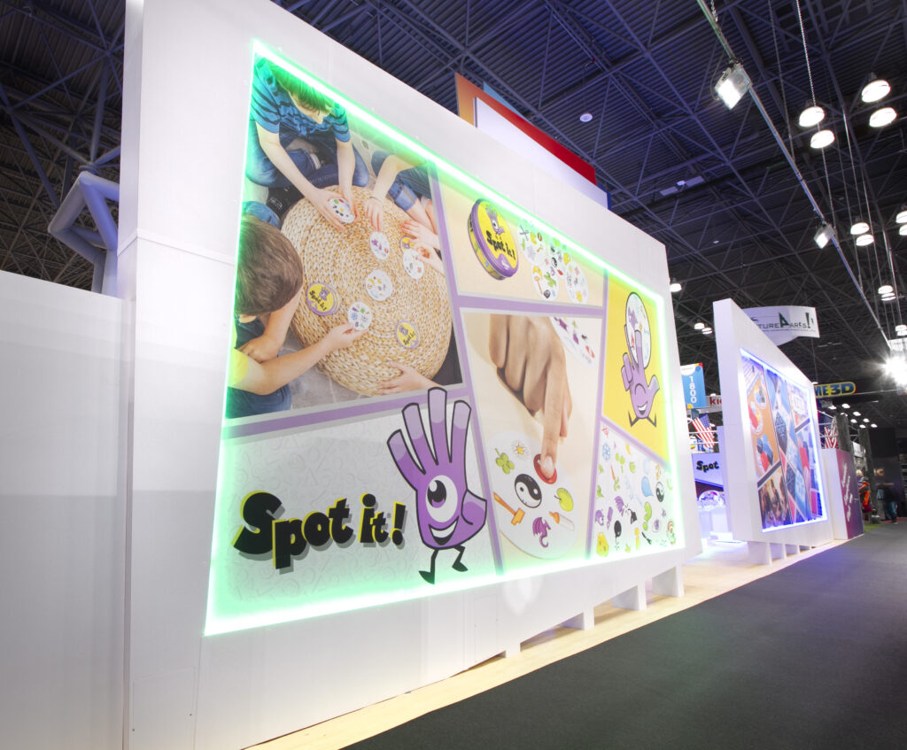
Fabric mural graphics don’t have the same size limitations as the rigid board applications described above. You’re free to go as high and wide as you like with no seams (or at least no noticeable seams). Since they can be huge murals, the effect can be super impactful.
SEG, as we sometimes commonly refer to it, is also much lighter and easier to ship than substrate-mounted prints.
There are tradeoffs though: The material is fabric (obviously) so doesn’t have a sheen to it, and this is sometimes read as a “not as rich” image. Also, it usually needs to have the folds of the fabric “ironed out” after it’s stretched- normally achieved with a common hair blow dryer.
On the other hand, you have the option to illuminate the SEG graphics from behind, creating a giant lightbox bound to catch the eye of anyone walking by.
SEG is an acronym for Silicone Edge Graphic, because the fabric has, you guessed it, a silicone edge that is pushed into a special channel in the metal extrusion frame over which the fabric is stretched. The SEG gasket, in other words, keeps the fabric taut.
Vinyl
Kind of like a sticker cut into the shape of your text or logo. Super inexpensive. Easy to peel off and apply a new set next event. Sticks right onto pretty much any hard surface you need to get it on and will appear flat, more or less.
There are a bunch of standard colors vinyl comes in. You can also print an image or a custom color onto vinyl (a little more expensive), cut that print into a contour shape, then apply it to your surface. As mentioned, it basically acts just like a sticker.
And like a sticker, the vinyl needs a smooth flat surface on which to adhere. It won’t work on something like a porous faux stone or fabric.

For the artwork you send in to the printer, you’ll need a cut line indicated in the art file—the computer program uses this line to guide the machine doing the cutting. This art format is typically a "vector line art based EPS or Illustrator file." File formats are a whole other can of worms, so if that’s too much in the weeds, consult with your graphic designer or printer (or with us!).
Die Cut Illuminated Graphics
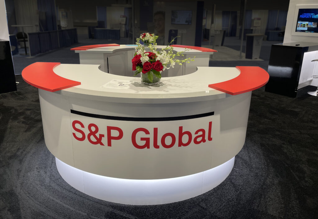
The term die cut may sound scary but it’s really just a term that refers to the process of machining shapes out of material. The phrase is archaic and has an interesting history behind it (check it out here if you’re so inclined), but for our purposes, die cut, also sometimes called pierce cut, means that your logo or letters are cut from a substrate, like the laminate finish of your counter, and that laminate is placed over illuminated plexi-glass, making your logo glow on a flat surface.
It’s a considerable upgrade from standard vinyl logo but keep in mind that it’ll be a bit more costly as well.
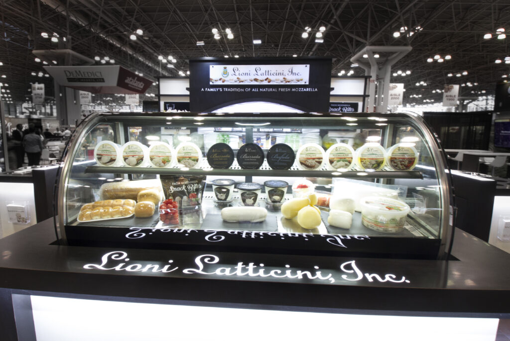

Like vinyl noted above, you'll need a cutline in your vector file.
Contour Cut Dimensional Letters or Logos
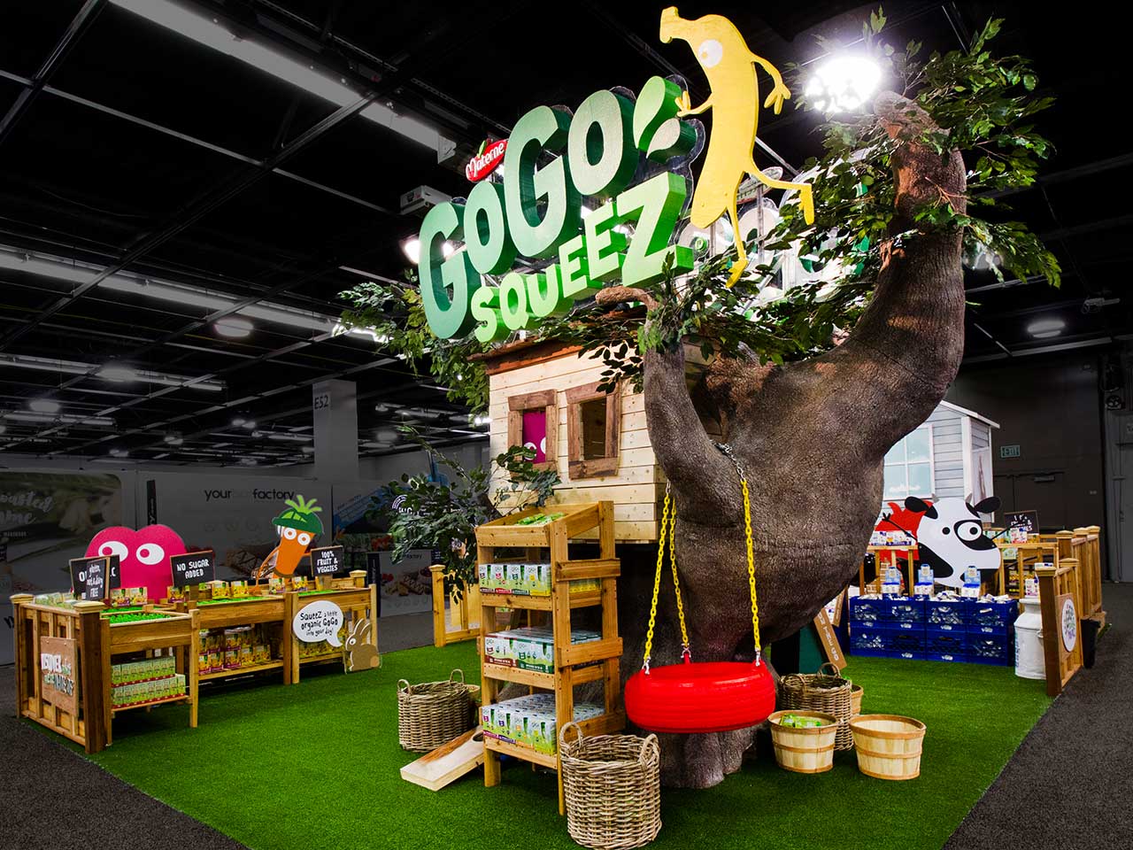
This is like vinyl production in many ways but cut dimensional letters have some, you guessed it, dimension to them. Think of it as a sculpture of a letter.
The letter or logo forms are typically “sculpted” from foam or thick sintra so they don’t have an adhesive backing inherent to the material. However, you can certainly add an adhesive (usually Velcro strips) to get them up onto a hard wall surface (or set them in a tree like we did for GoGo squeeZ!).
The material the forms are cut from typically comes half or three quarters of an inch thick. But you can double, triple, or whatever-stack them to add thickness. Keep in mind adding layers will add cost.
Like vinyl, you can use this in combination with a print—applying the custom color or image to the face of the contoured form. You’ll also need a cut line in the artwork.

Using sintra instead of foam for the letterforms is common. They hold up better under wear and tear, but at half an inch thick, sintra is not as dimensional.
Halo-Illuminated Letters or Logos
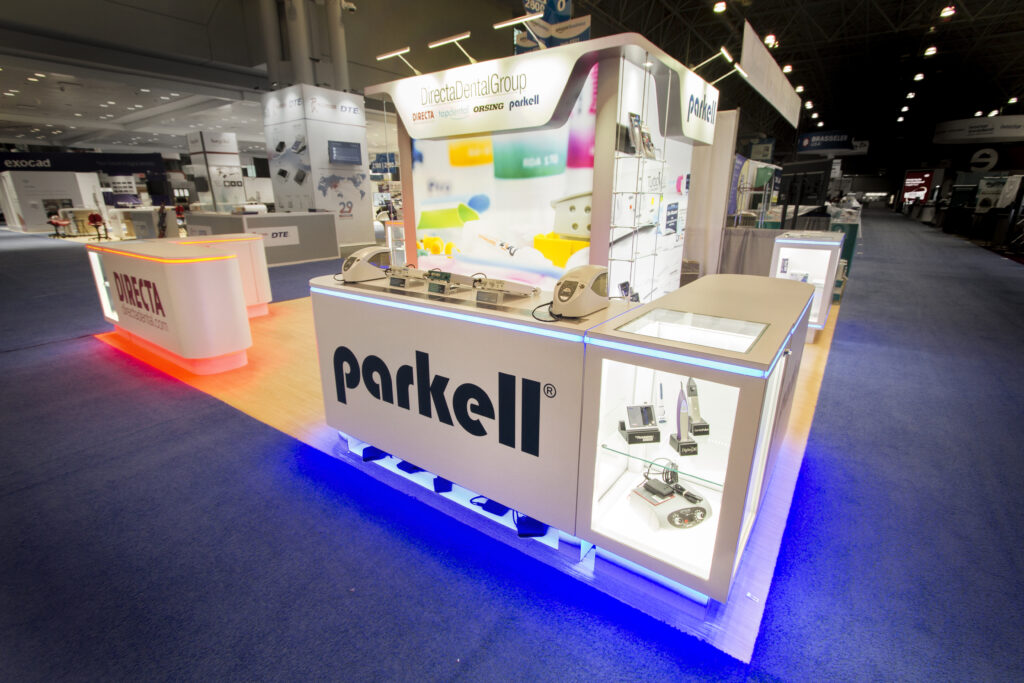
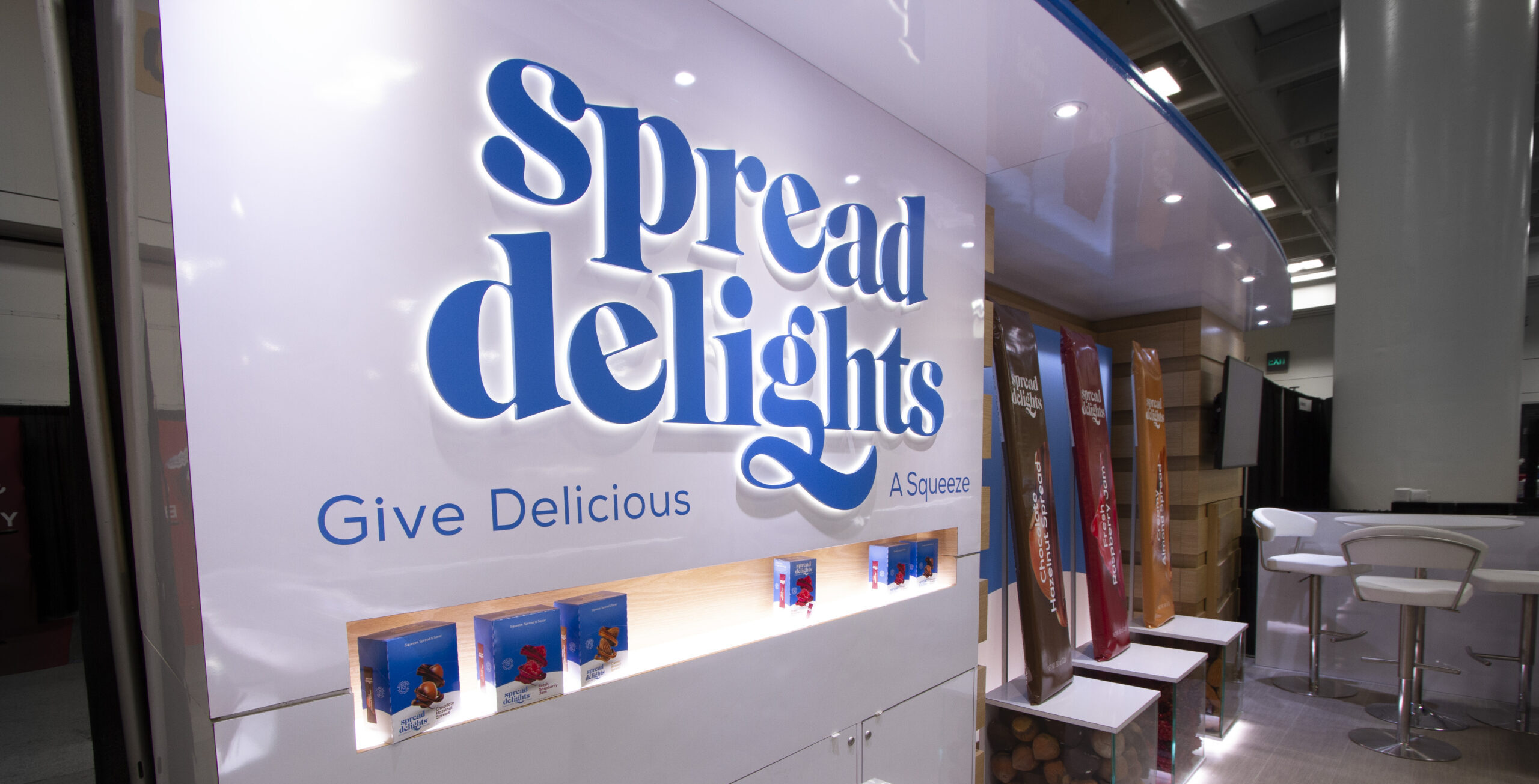
Now we’re starting to get fancy. These are dimensional letters or logos that have LED light strips behind them so light literally spills out from behind the forms, illuminating the area around the edges of the letterforms producing, you guessed it, a halo effect.
Neat option: instead of white light, you can use color-tunable LED light strips to get that light pretty much any color your heart desires.

A cut line will have to be in the art for this as well.
Edge-Illuminated Letters or Logo
This has a similar effect as halo-illuminated letters but it’s achieved in a different way: instead of foam or Sintra, the letterforms are cut from a semi-translucent substrate, like milk Plexiglas, and affixed on an illuminated surface.
This again produces an illumination around the edges of the letterforms. It’s subtler and perhaps appears a bit “cleaner” than halo illumination, but you won’t be able to mount the letters on a surface that’s not conducive to a surface illumination, like turf or faux stone. For that, you’d go with halo-illumination noted above.
Other than that, the decision to go with halo or edge-illumination is a matter of preference for the most part, and your exhibit partner will likely recommend the best route to go depending on the situation.

You'll also need a cut line in your art! Sensing a pattern?
Illuminated Channel or "Can" Letters
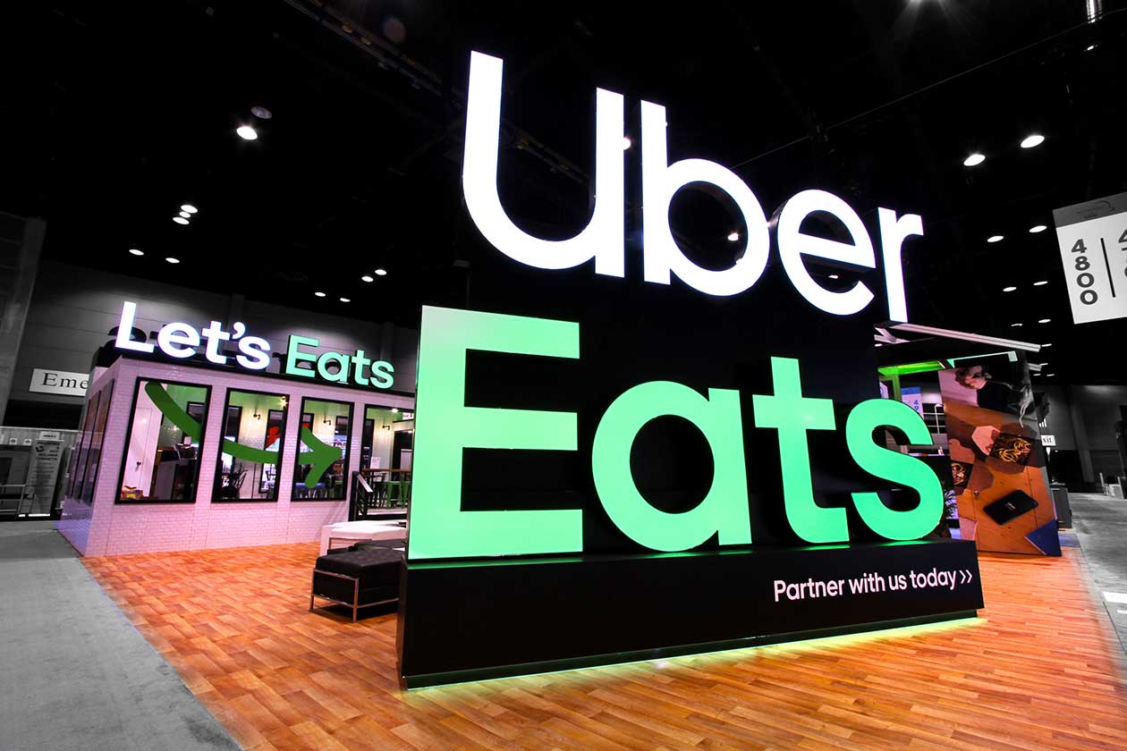
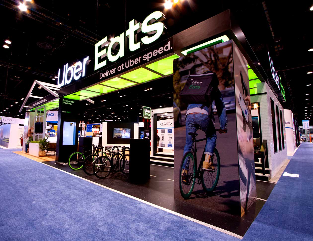
As with some of the above “sculptural” letter options, this is also a dimensional letterform application, but here, the faces of the letters are illuminated. How is this effect achieved, you ask? By fabricating the letterforms as “cans” (hence the name) and illuminating the faces from within the “channels” of the letterforms.
The letterforms can then be mounted to a wall surface, run along the top edge of a wall, or stand alone as a truly sculptural element in the space, like the below Uber Eats example we produced for their award-winning National Restaurant Association exhibit.
As you can see, illuminated can letters look fantastic, but this is a premium option and comes with a cost to match.
Now that you’re armed with some key insider knowledge, go forth bravely when discussing graphic applications with your exhibit or event designer.
Still have questions? Give us a shout. We’d love to walk you through all the ins and outs of graphic applications one on one.

